Kavi's BGGN 213 Portfolio

Class work for bioinformatics class
Class05: Data Viz with GGPLOT
Kavi (PID: A69046927)
Today we are playing and plotting graphics with R.
There are lots of ways to make cool figures in R. There is “base” R
graphics (plot(), hist(), boxplot(), etc.)
There is also add-on packages, like ggplot
head(cars)
  speed dist
1     4    2
2     4   10
3     7    4
4     7   22
5     8   16
6     9   10
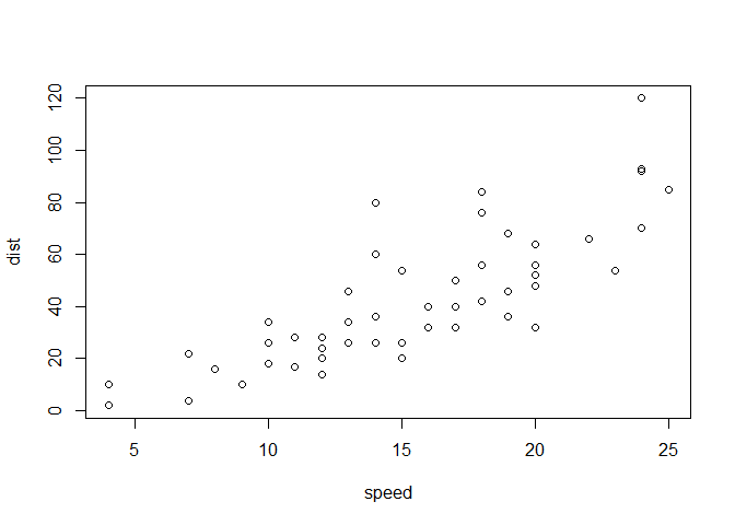
Let’s plot this with “base” R:
plot(cars)
head(mtcars)
                   mpg cyl disp  hp drat    wt  qsec vs am gear carb
Mazda RX4         21.0   6  160 110 3.90 2.620 16.46  0  1    4    4
Mazda RX4 Wag     21.0   6  160 110 3.90 2.875 17.02  0  1    4    4
Datsun 710        22.8   4  108  93 3.85 2.320 18.61  1  1    4    1
Hornet 4 Drive    21.4   6  258 110 3.08 3.215 19.44  1  0    3    1
Hornet Sportabout 18.7   8  360 175 3.15 3.440 17.02  0  0    3    2
Valiant           18.1   6  225 105 2.76 3.460 20.22  1  0    3    1
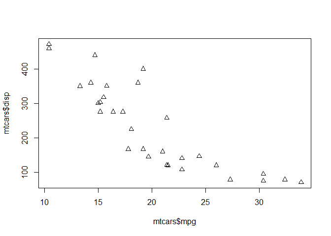
Let’s plot mpg vs disp
plot(mtcars$mpg,mtcars$disp, pch=2)
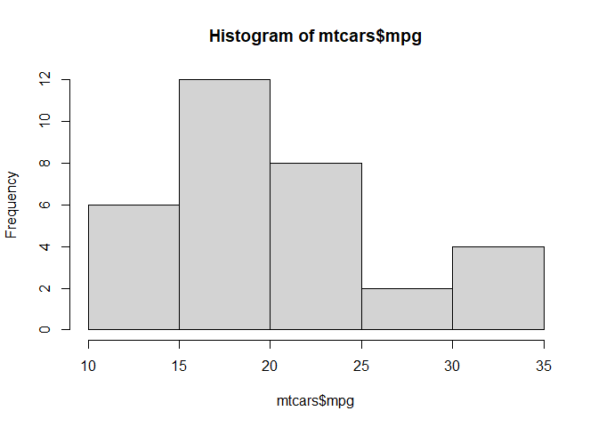
hist(mtcars$mpg)
GGPLOT
The main function in the ggplot2 package is ggplot(). First I need
to install the ggplot2 package. I can install any package with the
function install.packages().
N.B. I never want to run
install.packages()in my quarto source document!!!
library(ggplot2)
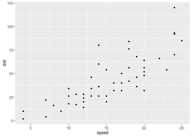
ggplot(cars) +
aes(x=speed,y=dist) +
geom_point()
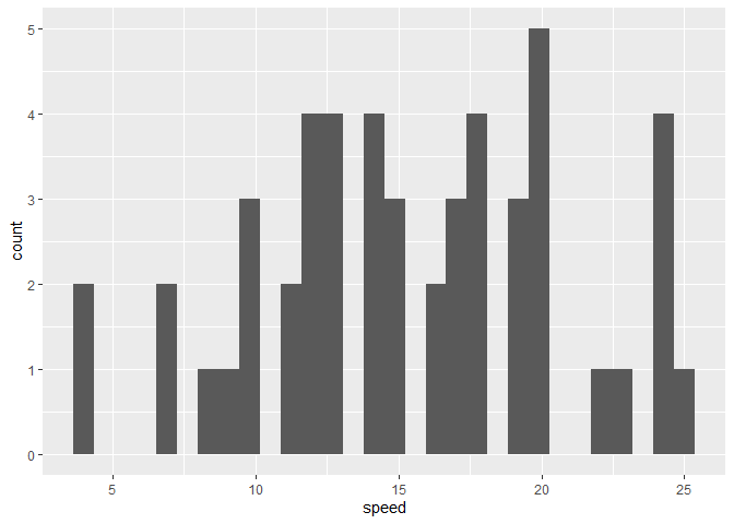
ggplot(cars) +
  aes(speed) +
  geom_histogram()
`stat_bin()` using `bins = 30`. Pick better value `binwidth`.
Every ggplot needs at least 3 things:
- The data (given with
ggplot(cars)) - The aesthetics mapping (given with
aes()) - The geom (given with
geom_point())
For simple canned graphs, “base” R is nearly always faster
Adding more layers
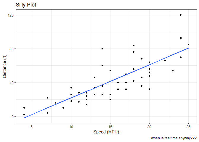
Let’s add a line and a title, subtitle and caption as well as custom axis labels
ggplot(cars) +
  aes(x=speed,y=dist) +
  geom_point() +
  geom_smooth(method="lm",se=FALSE) +
  labs(title = "Silly Plot",
       x = "Speed (MPH)",
       y = "Distance (ft)",
       caption="when is tea time anyway???") +
  theme_bw()
`geom_smooth()` using formula = 'y ~ x'
Plot some expression data
Read data file from online URL
url <- "https://bioboot.github.io/bimm143_S20/class-material/up_down_expression.txt"
genes <- read.delim(url)
head(genes)
        Gene Condition1 Condition2      State
1      A4GNT -3.6808610 -3.4401355 unchanging
2       AAAS  4.5479580  4.3864126 unchanging
3      AASDH  3.7190695  3.4787276 unchanging
4       AATF  5.0784720  5.0151916 unchanging
5       AATK  0.4711421  0.5598642 unchanging
6 AB015752.4 -3.6808610 -3.5921390 unchanging
Q1. How many genes are in this wee dataset?
There are 5196 in this dataset
Q2. How many “up” regulated genes are there?
sum(genes$State == "up")
[1] 127
There are 127 “up” regulated genes.
table(genes$State)
      down unchanging         up
        72       4997        127
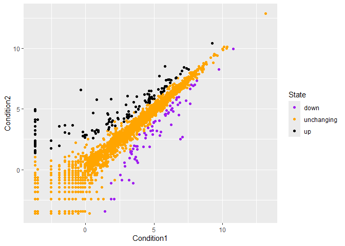
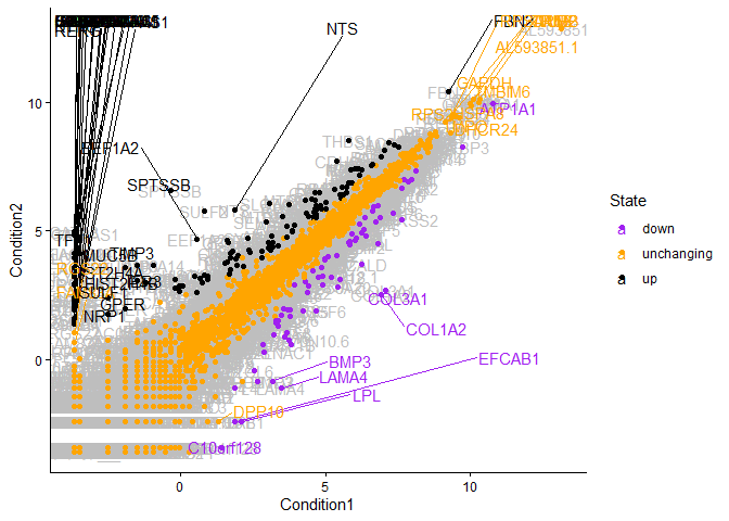
p<-ggplot(genes) +
    aes(x=Condition1, y=Condition2, col=State) +
    geom_point() +
    scale_color_manual(values=c("purple","orange","black"))
p
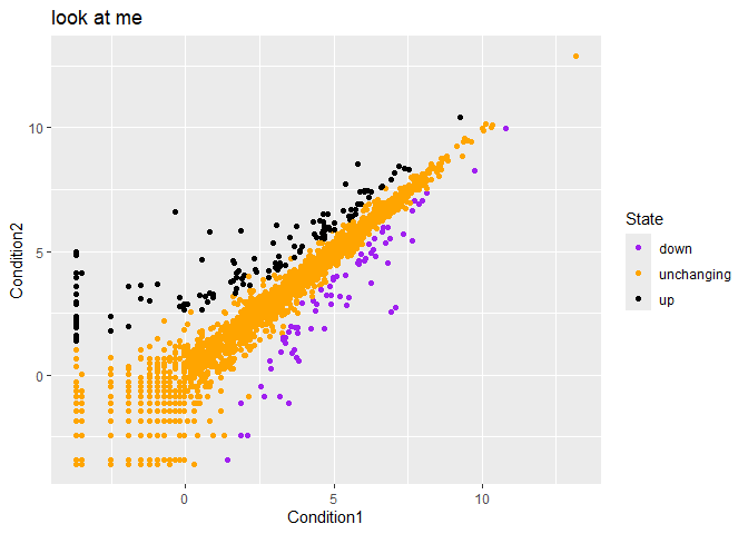
p + labs(title="look at me")
Silly example of adding labels
library(ggrepel)
pg<-ggplot(genes) +
    aes(x=Condition1, y=Condition2, col=State, label=Gene) +
    geom_text(color="gray") +
    geom_point() +
    scale_color_manual(values=c("purple","orange","black")) +
    geom_text_repel(max.overlaps=100) +
    theme_classic()
pg
Warning: ggrepel: 5141 unlabeled data points (too many overlaps). Consider
increasing max.overlaps
Going Further
Playing with different dataset to make something animated
url <- "https://raw.githubusercontent.com/jennybc/gapminder/master/inst/extdata/gapminder.tsv"

gapminder <- read.delim(url)
head(gapminder)
      country continent year lifeExp      pop gdpPercap
1 Afghanistan      Asia 1952  28.801  8425333  779.4453
2 Afghanistan      Asia 1957  30.332  9240934  820.8530
3 Afghanistan      Asia 1962  31.997 10267083  853.1007
4 Afghanistan      Asia 1967  34.020 11537966  836.1971
5 Afghanistan      Asia 1972  36.088 13079460  739.9811
6 Afghanistan      Asia 1977  38.438 14880372  786.1134
tail(gapminder)
      country continent year lifeExp      pop gdpPercap
1699 Zimbabwe    Africa 1982  60.363  7636524  788.8550
1700 Zimbabwe    Africa 1987  62.351  9216418  706.1573
1701 Zimbabwe    Africa 1992  60.377 10704340  693.4208
1702 Zimbabwe    Africa 1997  46.809 11404948  792.4500
1703 Zimbabwe    Africa 2002  39.989 11926563  672.0386
1704 Zimbabwe    Africa 2007  43.487 12311143  469.7093
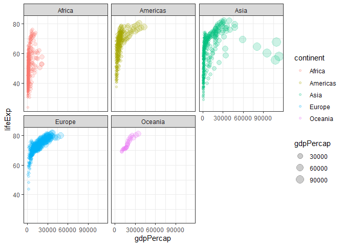
Classic plot of increasing GDP overtime.
ggplot(gapminder) +
         aes(x=gdpPercap,y=lifeExp, col=continent, size=gdpPercap) +
         geom_point(alpha=0.2) +
        facet_wrap(~continent) +
        theme_bw()
Wanted to try spitting more bars… couldn’t
ggplot(gapminder) +
   aes(x=lifeExp) +
  geom_bar()
Bonus gganimate code that never rendered lol
library(gapminder) library(gganimate)
Setup nice regular ggplot of the gapminder data
ggplot(gapminder, aes(gdpPercap, lifeExp, size = pop, colour = country)) + geom_point(alpha = 0.7, show.legend = FALSE) + scale_colour_manual(values = country_colors) + scale_size(range = c(2, 12)) + scale_x_log10() + # Facet by continent facet_wrap(~continent) + # Here comes the gganimate specific bits labs(title = ‘Year: {frame_time}’, x = ‘GDP per capita’, y = ‘life expectancy’) + transition_time(year) + shadow_wake(wake_length = 0.1, alpha = FALSE) ```