Kavi's BGGN 213 Portfolio

Class work for bioinformatics class
Class 7
Kavi (PID: A69046927)
Today, we will begin our exploration of some “classical” machine learning approaches. We will start with clustering:
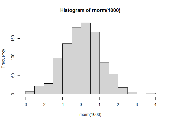
Let’s first male∈up some data cluster where we know what the answer should be:
hist(rnorm(1000))
x <- c(rnorm(30,mean=-3),rnorm(30,mean=3))
y <- rev(x)

x <- cbind(x,y)
A wee peak at x with plot()
plot(x)

The main function in “base” R for K-means clustering is called
kmeans().
k <- kmeans(x,centers=4)
k
K-means clustering with 4 clusters of sizes 14, 16, 16, 14

Cluster means:
          x         y
1  3.785856 -3.028809
2  2.204012 -2.487247
3 -2.487247  2.204012
4 -3.028809  3.785856

Clustering vector:
 [1] 4 3 4 3 3 4 3 4 3 3 4 4 4 4 3 4 3 4 3 4 3 3 3 3 4 3 4 3 4 3 2 1 2 1 2 1 2 2
[39] 2 2 1 2 1 2 1 2 1 1 1 1 2 2 1 2 1 2 2 1 2 1

Within cluster sum of squares by cluster:
[1] 15.29709 16.40294 16.40294 15.29709
 (between_SS / total_SS =  94.1 %)

Available components:

[1] "cluster"      "centers"      "totss"        "withinss"     "tot.withinss"
[6] "betweenss"    "size"         "iter"         "ifault"
Q. How big are the clusters (i.e. their size)?
k$size
[1] 14 16 16 14
Q. What clusters do my data points reside in?
k$cluster
 [1] 4 3 4 3 3 4 3 4 3 3 4 4 4 4 3 4 3 4 3 4 3 3 3 3 4 3 4 3 4 3 2 1 2 1 2 1 2 2
[39] 2 2 1 2 1 2 1 2 1 1 1 1 2 2 1 2 1 2 2 1 2 1
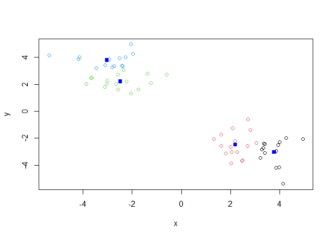
Q. Make a plot of our data colored by cluster alignment - i.e. make a result figure…
plot(x, col=k$cluster)
points(k$centers,col="blue",pch=15)
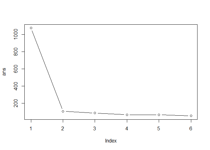
Q. Run kmeans with center (i.e. values of k) equal 1 to 6
k1 <- kmeans(x,centers=1)$tot.withiness
k2 <- kmeans(x,centers=2)$tot.withiness
k3 <- kmeans(x,centers=3)$tot.withiness
k4 <- kmeans(x,centers=4)$tot.withiness
k5 <- kmeans(x,centers=5)$tot.withiness
k6 <- kmeans(x,centers=6)$tot.withiness

ans <- c(k1,k2,k3,k4,k5,k6)
Or use a for loop:
ans <- NULL
for(i in 1:6) {
  ans <- c(ans,kmeans(x,centers=i)$tot.withinss)
}
ans
[1] 1073.76219 105.14653 84.27330 63.70085 65.53319 51.55767
plot(ans,typ="b")
Hierarchical Clustering
The main function in “base” R for this is called hclust().
d <- dist(x)
hc <- hclust(d)
hc
Call:
hclust(d = d)

Cluster method   : complete
Distance         : euclidean
Number of objects: 60
plot(hc)
abline(h=7,col="red")
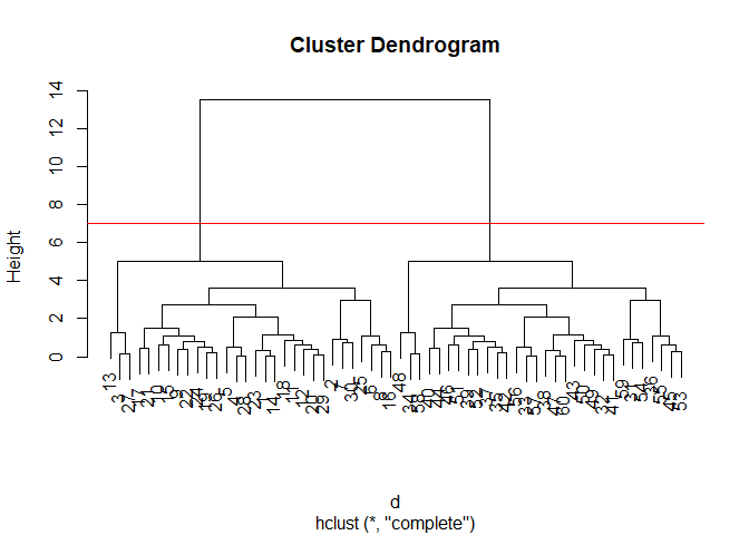
To obtain clusters from our hclust output result object hc we
“cut” the tree to yield different sub branches. For this, we use the
cutree() function.
grps <- cutree(hc,h=7)
grps
 [1] 1 1 1 1 1 1 1 1 1 1 1 1 1 1 1 1 1 1 1 1 1 1 1 1 1 1 1 1 1 1 2 2 2 2 2 2 2 2
[39] 2 2 2 2 2 2 2 2 2 2 2 2 2 2 2 2 2 2 2 2 2 2
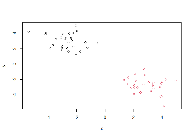
plot(x,col=grps)
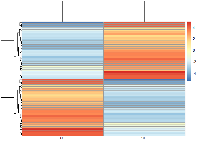
library(pheatmap)

pheatmap(x)
Principal Component Analysis (PCA)
UKfoods <- read.csv("https://tinyurl.com/UK-foods")
Q1. How many rows and columns are in your new data frame named x? What R functions could you use to answer this questions?
dim(UKfoods)
[1] 17 5
head(UKfoods)
               X England Wales Scotland N.Ireland
1         Cheese     105   103      103        66
2  Carcass_meat      245   227      242       267
3    Other_meat      685   803      750       586
4           Fish     147   160      122        93
5 Fats_and_oils      193   235      184       209
6         Sugars     156   175      147       139
# Note how the minus indexing works
rownames(UKfoods) <- UKfoods[,1]
UKfoods <- UKfoods[,-1]
head(UKfoods)
               England Wales Scotland N.Ireland
Cheese             105   103      103        66
Carcass_meat       245   227      242       267
Other_meat         685   803      750       586
Fish               147   160      122        93
Fats_and_oils      193   235      184       209
Sugars             156   175      147       139
UKfoods <- read.csv("https://tinyurl.com/UK-foods", row.names=1)
head(UKfoods)
               England Wales Scotland N.Ireland
Cheese             105   103      103        66
Carcass_meat       245   227      242       267
Other_meat         685   803      750       586
Fish               147   160      122        93
Fats_and_oils      193   235      184       209
Sugars             156   175      147       139
Q2. Which approach to solving the ‘row-names problem’ mentioned above do you prefer and why? Is one approach more robust than another under certain circumstances?
The second one
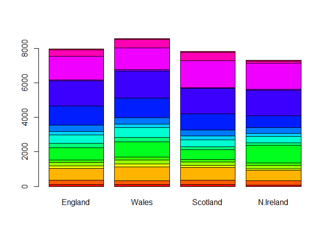
barplot(as.matrix(UKfoods), beside=T, col=rainbow(nrow(UKfoods)))
Q3: Changing what optional argument in the above barplot() function results in the following plot?
barplot(as.matrix(UKfoods), beside=F, col=rainbow(nrow(UKfoods)))
library(ggplot2)
library(tidyr)
library(tibble)
UKfoods_long <- UKfoods |>
          tibble::rownames_to_column("Food") |>
          pivot_longer(cols = -Food,
                       names_to = "Country",
                       values_to = "Consumption")
head(UKfoods_long)
# A tibble: 6 × 3
  Food            Country   Consumption
  <chr>           <chr>           <int>
1 "Cheese"        England           105
2 "Cheese"        Wales             103
3 "Cheese"        Scotland          103
4 "Cheese"        N.Ireland          66
5 "Carcass_meat " England           245
6 "Carcass_meat " Wales             227
dim(UKfoods_long)
[1] 68 3
ggplot(UKfoods_long) +
  aes(x = Country, y = Consumption, fill = Food) +
  geom_col(position = "dodge") +
  theme_bw()
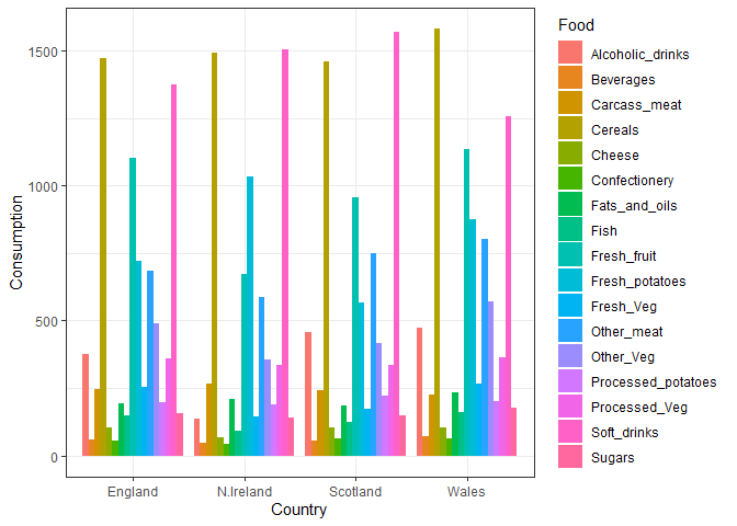
Q4: Changing what optional argument in the above ggplot() code results in a stacked barplot figure?
head(UKfoods_long)
# A tibble: 6 × 3
  Food            Country   Consumption
  <chr>           <chr>           <int>
1 "Cheese"        England           105
2 "Cheese"        Wales             103
3 "Cheese"        Scotland          103
4 "Cheese"        N.Ireland          66
5 "Carcass_meat " England           245
6 "Carcass_meat " Wales             227
dim(UKfoods_long)
[1] 68 3
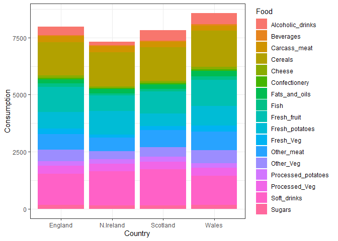
ggplot(UKfoods_long) +
  aes(x = Country, y = Consumption, fill = Food) +
  geom_col(position = "stack") +
  theme_bw()
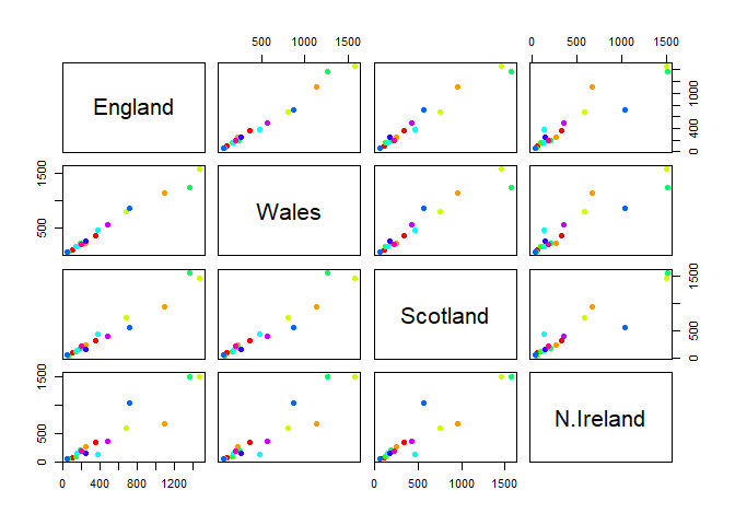
Q5: Generating all pairwise plots may help somewhat. Can you make sense of the following code and resulting figure? What does it mean if a given point lies on the diagonal for a given plot?
pairs(UKfoods, col=rainbow(10), pch=16)
library(pheatmap)
pheatmap(UKfoods)
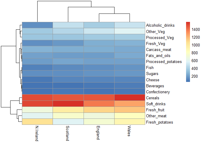
Q6. What is the main differences between N. Ireland and the other countries of the UK in terms of this data-set?
North Ireland eats more potatoes and less other meat than other countries.
PCA to the rescue
The main function in “base” R for PCA is called prcomp().
As we want to do PCA on the food data for the different countries we will want the foods in the columns.
# Use the prcomp() PCA function
pca <- prcomp( t(UKfoods) )
summary(pca)
Importance of components:
                            PC1      PC2      PC3       PC4
Standard deviation     324.1502 212.7478 73.87622 3.176e-14
Proportion of Variance   0.6744   0.2905  0.03503 0.000e+00
Cumulative Proportion    0.6744   0.9650  1.00000 1.000e+00
Our result object is called pca and it has a $x component that we
will look at first.
pca$x
                 PC1         PC2        PC3           PC4
England   -144.99315   -2.532999 105.768945 -4.894696e-14
Wales     -240.52915 -224.646925 -56.475555  5.700024e-13
Scotland   -91.86934  286.081786 -44.415495 -7.460785e-13
N.Ireland  477.39164  -58.901862  -4.877895  2.321303e-13
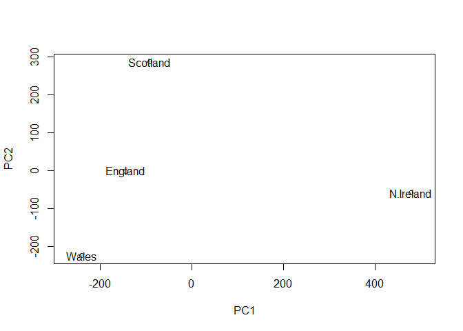
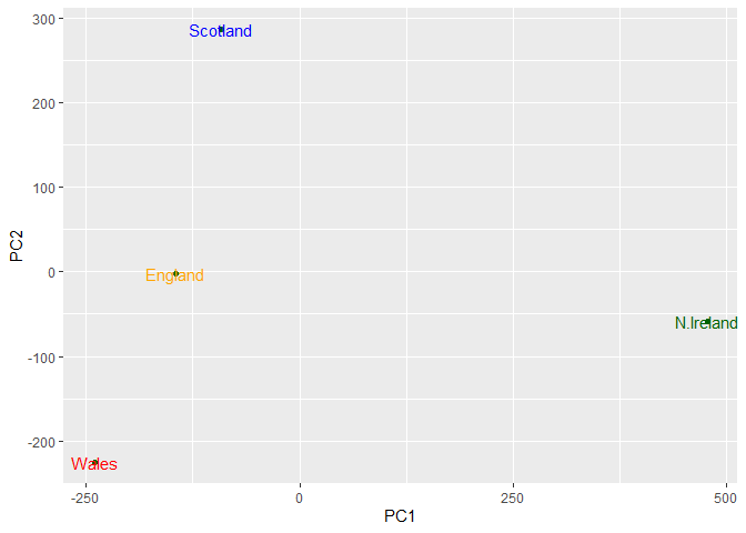
Q7. Complete the code below to generate a plot of PC1 vs PC2. The second line adds text labels over the data points. Q8. Customize your plot so that the colors of the country names match the colors in our UK and Ireland map and table at start of this document.
library(ggplot2)

cols <- c("orange", "red", "blue", "darkgreen")
ggplot(pca$x) +
  aes(x = PC1, y = PC2, label = rownames(pca$x)) +
  geom_point(color = "darkgreen") +
  geom_text(color=cols)
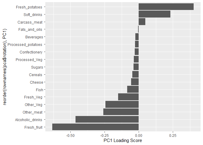
Another major result out of PCA is the so-called “variable loadings” or
$rotation that tells us how the original variables (foods) contribute
to PCs (the new axis)
pca$rotation
                             PC1          PC2         PC3          PC4
Cheese              -0.056955380  0.016012850  0.02394295 -0.694538519
Carcass_meat         0.047927628  0.013915823  0.06367111  0.489884628
Other_meat          -0.258916658 -0.015331138 -0.55384854  0.279023718
Fish                -0.084414983 -0.050754947  0.03906481 -0.008483145
Fats_and_oils       -0.005193623 -0.095388656 -0.12522257  0.076097502
Sugars              -0.037620983 -0.043021699 -0.03605745  0.034101334
Fresh_potatoes       0.401402060 -0.715017078 -0.20668248 -0.090972715
Fresh_Veg           -0.151849942 -0.144900268  0.21382237 -0.039901917
Other_Veg           -0.243593729 -0.225450923 -0.05332841  0.016719075
Processed_potatoes  -0.026886233  0.042850761 -0.07364902  0.030125166
Processed_Veg       -0.036488269 -0.045451802  0.05289191 -0.013969507
Fresh_fruit         -0.632640898 -0.177740743  0.40012865  0.184072217
Cereals             -0.047702858 -0.212599678 -0.35884921  0.191926714
Beverages           -0.026187756 -0.030560542 -0.04135860  0.004831876
Soft_drinks          0.232244140  0.555124311 -0.16942648  0.103508492
Alcoholic_drinks    -0.463968168  0.113536523 -0.49858320 -0.316290619
Confectionery       -0.029650201  0.005949921 -0.05232164  0.001847469
ggplot(pca$rotation) +
  aes(PC1,reorder(rownames(pca$rotation),PC1)) +
  geom_col() +
  xlab("PC1 Loading Score")
Q7. Complete the code below to generate a plot of PC1 vs PC2. The second line adds text labels over the data points.
Plot PC1 vs PC2
plot(pca$x[,1], pca$x[,2], xlab = "PC1", ylab = "PC2", xlim = c(-270, 500))
text(pca$x[,1], pca$x[,2], colnames(UKfoods))